


In my last post, I looked at which Maple Leaf players are producing their fair share of the offense. In the comments to that post, a few readers wanted me to take a look at the players defensively to see who is performing up to par in that aspect of the game. Today, I’ll look at the defensive side of the game in conjunction with their offensive performance.
It may be worth while to go back and read it now if you haven’t yet read the previous article, but I’ll remind you of the process below:
[quote_box_center]If you are not yet aware, I have recently launched a new hockey statistics website at Puckalytics.com. Long-term this will be the replacement for stats.hockeyanalysis.com, but not all features are implemented yet; for now, both will remain operational. There are some new statistics available at Puckalytics.com and one of those features is the ability to find the percentage of a team’s overall statistic that the player was on the ice for. I call these ‘% of Team Stats’ and they can be found here.
To explain exactly what these statistics mean, let’s look at % of Team TOI. Last season, Ryan Suter led the NHL with a 5v5 % of Team TOI of 44.98%, which means in games that he played in he was on the ice for 44.98% of all the 5v5 play. He also had a 5v5 % of Team GF of 46.92%, which means in the games he played in he was on the ice for 46.92% of all goals scored by the Wild during 5v5 play. As we can see, Suter was on the ice for a higher percentage of the goals for than ice time (a good thing). He also has a % of Team GA of 42.24%, meaning he was on the ice for a lower percentage of the goals against than 5v5 ice time. This is also a good thing. This is really just another way of looking at on-ice performance relative to the team.
Now, what I did was look at the Maple Leaf forwards to see how their % of Team GF compared with their % of Team TOI over the past 3 seasons during 5v5 play. I did this by comparing the ‘ratio of % of Team GF’ to ‘% of Team TOI.’ This tells us how much offense was produced relative to both their teammates and to how much ice time they were given. Numbers above 1.00 mean that more offense was produced during their ice time than their average teammate and numbers below 1.00 means less offense was produced.
Now, what this doesn’t tell us is how directly involved the player was in that offensive production. To account for this, I looked at their individual points percentage: The percentage of the goals scored while the player was on the ice that the player had a point on (i.e. scored the goal or assisted on it). The higher the number means the more directly involved in the offensive production the player was.[/quote_box_center]
I then went on to show a chart of % of Team GF / % of Team TOI vs IPP. Since we don’t really have a defensive equivalent of IPP, I instead just plotted % of Team GF / % of Team TOI on the x-axis vs % of Team GA / % of Team TOI on the y-axis. Thus, the following chart for forwards charts offense on the horizontal axis (the further right, the higher share of offense player was on the ice for; further right is better) and defense on the vertical axis (the higher up the dot, the higher share of goals against player was on the ice for; lower is better).
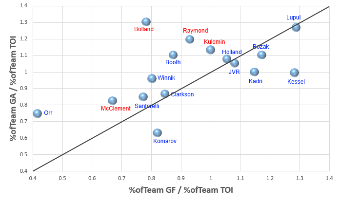
Anything below the diagonal line means player has performed better than their teammates overall. Players in blue are still with the organization, while players in red left the team this past off season. Anything to the right of the vertical 1 line (that passes right through the Kulemin bubble) means the player was on the ice for a greater share of the offense than expected based on their share of ice time. A location below the horizontal 1 line (the line that passes right through the Kadri and Kessel bubbles) indicates the player was on the ice for a smaller share of the goals against than expected based on ice time.
So yes, Kessel is good, and Bolland and Orr are bad. It is worth remembering that a significant portion of Bolland’s ice time is with the very good and deep Chicago team, making his comparables significantly better than anyone else on this chart, but he is still a long way from the “break even” line.
Leo Komarov looks pretty good defensively here, but remember he only has one season in the NHL and there is a fair amount of uncertainty there. Still, it’s promising to see him there. This chart also shows you how valuable Nazem Kadri can be; he probably deserves more minutes and a bigger role than he has been getting (especially when trailing and in need of more offensive production).
That is the forwards broken down. What about the defense?
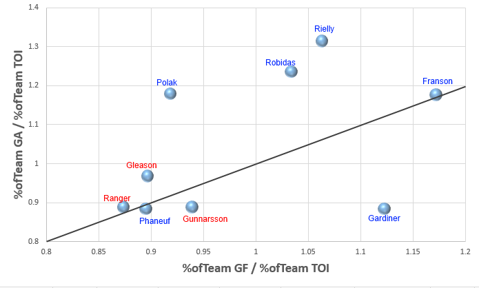
Due to the positioning of the players, I had to use a slightly different (larger) vertical scale than horizontal one, which is why the diagonal line is not perfectly fitted to the chart. However, it is a 1:1 line and shows the ‘break even’ line.
Based on the above chart, it seems that Roman Polak and Stephane Robidas are far from a guaranteed upgrade on Ranger/Gleason/Gunnarsson. They may produce more offense (Robidas mostly), but defensively they are comparatively poor. Now, both Polak and Robidas have played on better teams with some really good defensemen (particularly Polak), but like Bolland they are a long way from being on the good side of the break even line.
Now for Jake Gardiner. I don’t know what the coaching staff isn’t seeing from him to the point of being a healthy scratch against the Rangers, but from almost the day he joined the team he has looked really good statistically. It’s probably been two years since I first suggested that he might actually be the Leafs best defenseman and nothing has changed since then. He is 24 years old, entering his prime years, and is probably the best defenseman on the team. He should be playing 20+ minutes every game. Unfortunately, coaches and management are tying their ship to Phaneuf, Polak and Robidas, while I expect we’ll see Rielly, Franson, Gardiner and Percy rotate in and out of the line up throughout the season.


